


Why do I love so many shades of green?
More background and inspiration around color in this blog. For me the first thing I look at when I am shopping for cushions, paint, towels etc. is green. Why?
How to find a color palette for your house
Do you recognize the problem? There are so many beautiful colors and you look at Pinterest and one moment you think:
….white, yes it is clear and calm, I make all walls white!
…. blue, yes blue, but is my living room going to be more a holiday house by the sea?
…. I love natural colors but is that boring?
With this blog I want to give you some background about color choices so it will be easier for you to make YOUR OWN COLOR PALETTE
Some color history
Johan Wolfgang Goethe was not only a German writer/poet but also a scientist. He devoted much of his life to the study of colors. Although Isaac Newtons ideas about colors are more accepted Goethe was more interested in the psychological effects of colors.
Isaac Newton first passed white light through a prism and watched it fan out into a rainbow, he identified seven constituent colors: red, orange, yellow, green, blue, indigo, and violet. Also known as the color wheel. This was the start of color theory.
The color circle from artist, designer and professor Johannes Itten is used from early 20th century. Itten describes the primary colors red, yellow and blue. The secondary colors orange, green and violet and the tertiary colors arising from the mixing of a primary and a secondary color.

Especially the seven color contrasts are still used in interior design.
Itten’s seven color contrasts are:
- the color-to-color contrast;
- the light-dark contrast;
- the warm-cold contrast;
- the complementary contrast;
- the simultaneous contrast;
- the quality contrast;
- the quantity contrast.
if you want to read more about this: Johannes Itten – Kunst der Farbe
The words associated to colors
Goethe was more looking at the psychological effects of color. To give an impression of what a color can do with you some associations:
GREEN: relaxed, balanced, peace, nature, creative thinking, restful, quiet
YELLOW: happiness, lively, energy, stimulating, intellectual, organized
ORANGE, enthusiasm, fascination, happiness, creativity, determination, attraction, success, encouragement, and stimulation.
RED: strength, attention, excitement, energy, passion, sensual, impulsive
VIOLET: sophistication, peace, balance, wisdom, spiritual
BLUE: trustworthy, cool, strong, relaxed, tranquil, comforting
Use this information for the room or area you want to transform. Violet for your walk-in closet gives that luxurious feeling, Green in your bedroom makes you want to sleep, yellow in the hallway gives you energy when you enter your home, etc.
Some neutral colors
WHITE: pure, clarity, fresh,
GRAY: soothing and cooling presence
BLACK: industrial, accent, serious, dramatic
BROWN, warm, secure, stable
What you need to know to choose your colors
Look at your wardrobe, towels, vases, art etc. Is there a color that you choose every time? This can be your guide for choosing a Color Palette. Of course if Red is often present you have to be aware that a red kitchen can be a bad investment, because it is difficult to change if your taste is changing or the color is disappointing, so think more of a painted red wall (can be changed in an afternoon and relatively cheap) or in the accessories.
Use the neutrals for high investment pieces like sofa, carpet, kitchen etc.
For colors there are 3 dimensions you have to keep in mind:
- the hue (the name of the color as we are used to)

- the value, how light or dark is the color (the overall intensity with more white in the high value and more black in the low value)

- Chroma or saturation, the perceived strength of the color. On the outer edge of the hue wheel are the intensely saturated hues. Towards the center of the color wheel, no hue dominates and they becomes less and less saturated. (it is more the difference between bright and pale)


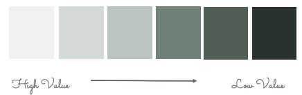
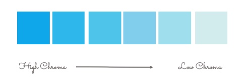
Why is this important, well if you want to use a monochromatic palette you can pull the colors from the same vertical area on a color scheme.

But if you want to use different colors you can connect those colors by using the same degree of light (Value) and/or saturation (Chroma). Using this strategy you can tie it all together.

The different ways of describing a color collection
It can help you to choose from an existing collection of a paint company. The colors are already well coordinated so this can get you started.
Color collections based on:
- the specific names, the hues of the colors, like, yellow, green, red, blue;
- if it is in between two colors combinations like green-yellow, purple-red;
- on a product we know, like olive, jade, sage, basil, lime;
- on a mood, yellow stands for a sunny mood, red for a passionate feeling, blue for a feeling of freedom
- on heritage like a lot of colors from Farrow & Ball, for example: Manor house grey “Named after the houses traditionally inhabited by the local lord”
Sikkens has a collection based on the Rijksmuseum colors, during the renovation of the museum Sikkens developed together with experts of Restoration Atelier Limburg about sixty colors as used by architect Pieter Cuypers in 1880. Now you have a choice out of 25 “Cuypers Colors” to bring inside your home. Another historic collection is based on the Van Gogh colors. can you imagine the characteristic Van Gogh Sunflower colors in your bedroom!
Ressource has a heritage and nature collection of more than 360 shades which compose an infinite range of colors.
Benjamin Moore has a heritage collection based on 191 colors inspired by America’s historic landmarks.
- architectural styles; contemporary, traditional, modern, art deco
- nature; Rocky Mountains by Benjamin Moore
- countries; colorful Mexico, earthy Morocco, Scandinavian calm, Dulux has a collection Colors of NZ
- Brands: for example Pottery Barn at Sherwin-Williams
Some tools
analyzers
- Canva, take a favorite painting, a vase, multicolored textile etc. and make an image of it. With Canva you can analyze the colors in the image and decide which colors you want to use in your room. image color analyzer
- Valspar, works in the same way but you can use your Pinterest board for it. Pinterest color analyzer
- E-paint, if you have seen a beautiful color and you want to find it in your favorite rangeof a paint company. (because there are so many different paint systems this can be very useful).
visualizers
- Sherwin-Williams, if you want to see how a color looks on your wall
- Dulux, paint color visualizer
- Flexa has a visualizer app
- Sikkens has a visualizer app
how to
- Homedepot, How to paint a room in a youtube video
- Benjamin Moore, How to advice
- Sherwin-Willimas, how to paint your interior
- Happy DIY Home: if you want to know more about the costs of painting a room.
Now it’s your turn, how to start
- Decide which atmosphere you want to create;
- Use magazines, pinterest, samples and your favorite color to make a dedicated color moodboard;
- Choose your color palette of about 4 colors; 2 main colors, an additional 3rd color and an accent color;
- Use the tools mentioned like a visualizer;
- Make your color guide;
- Buy samples. Farrow and Ball advices: “We suggest painting an A4 piece of card in your chosen colour, this way you can move the sample around the room to fully appreciate how the colour will look. The painted sample will also be really useful when choosing co-ordinating fabrics and furnishings”;
- Have a look at the samples on different walls and on daytime and in evening light;
- Satified? START THE JOB
Thats why I love all shades of green
Of course I wanted to answer the question “why I love al shades of green” by writing this post. Green is the color of creative thinking and tranquility. Qualities I have (or that I would like to have). Also nature is important and nature (especially gardens) is a great love. That made it clear to me why I love this color.
Inspiration
Find more inspiration on pinterest
Other interior design tools:
- How to find your interior design style
- How to draw a floor plan
- How to make an interior design mood board


